
The Psychology of Colour
Colour is more than just for visual pleasure; it is a powerful tool that influences mood, and psychological responses. In interiors, it needs to be given careful consideration, as the overall objective of interior design should be to create a beautiful environment which enhances the wellbeing of the space's occupants.

COLOUR IS MORE THAN JUST FOR VISUAL PLEASURE…
Colour psychology studies show how hues can dictate our feelings, emotions and overall mood. Take the example of my friend, who insisted on painting her walls in her living room bright orange, much to her husband's dismay. Their constant quarreling is testament to the power that colour has over our emotional responses and how it can impact our mood. Orange is a colour which evokes a feeling of vibrancy and energy, a good colour for exercise rooms or any space where you need a burst of enthusiasm. Certainly not the colour for a relaxing open plan living room kitchen, the central hub of the house.
Googles Exhibition at the Salon De Mobilier in Italy this year, demonstrated to visitors just this. The Google exhibition showcased the company's innovative approach to design, with a strong focus on color psychology. The exhibition featured interactive installations that explored the impact of colour on mood, emotions, and behaviour.
Google’s displays demonstrated how different hues could influence a person's sense of well-being and productivity. They also illustrated how color choices could shape the atmosphere of living and working spaces, highlighting Google's emphasis on user-centric design principles that take into account the psychological effects of color.
The exhibition seamlessly integrated technology and design, emphasizing the role of color in creating functional and aesthetically pleasing environments. The power of colour to affect both our biology and psychology and how powerful it is in evoking emotions
COLOURS ARE CHOSEN TO INVOKE A REACTION AND CREATE A MOOD…
In 1810 Johan Wolfgang von Goethe made a significant contribution to our understanding of colour through his work “theory of Colour”. His work reminds us that our experience of the world is not shaped by physical phenomena alone but by our sensory and emotional responses to those phenomena.
In interior design colours are chosen to invoke a particular reaction within people and to create a mood. When making choices in your own home, be sure to make them when you are in a positive headspace. Be careful that the colour you are attracted to at the time, may reinforce how you feel at that particular moment. Something along the lines of don’t go grocery shopping when you are hungry.
COLOURS & THEIR PSYCHOLOGICAL EFFECT

Blue: known for its calming and serene effects.
Ideal for bedrooms and bathrooms where relaxation is paramount
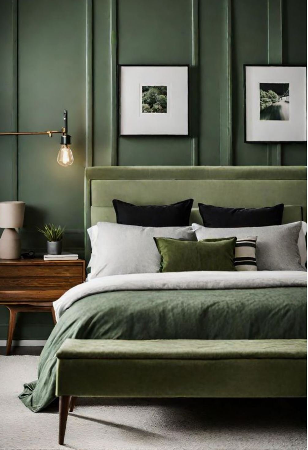
Green: The colour we associate with nature, promotes tranquility and health.
Perfect colour for spaces you want to foster rejuvenation like a reading room or a home office
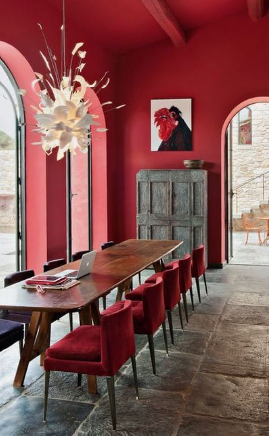
Red: Often linked to excitement and passion.
Red works well in areas which need a high energy level

Purple: Dark purple can evoke a feeling of luxury while lighter shades like lavender can instil a soothing calming feeling.
Good for use in Spas and wellness areas
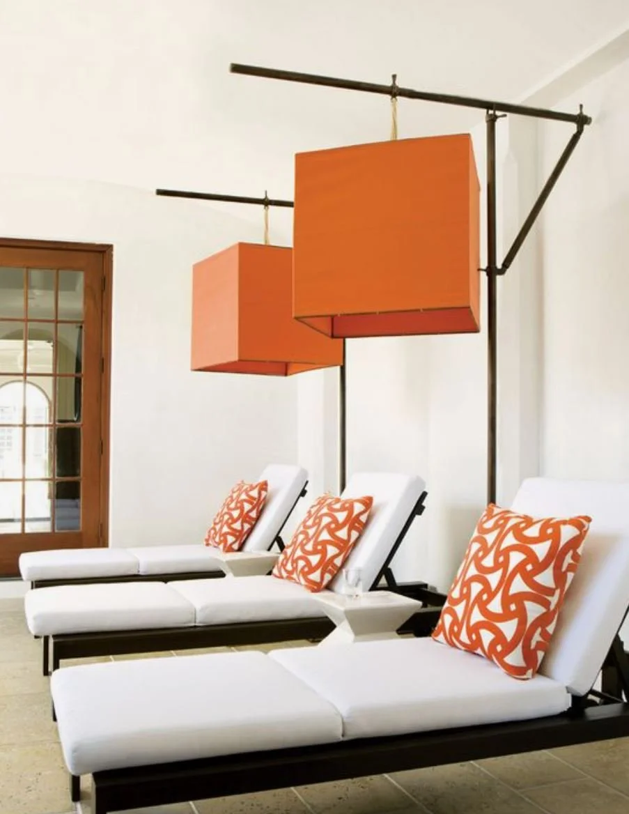
Orange: Vibrant and energetic, great for spaces that need energy like exercise rooms

Neutrals: These colours offer a background, like an artists canvas you can keep the palette neutral all the way through.
Add the true for interest or you can add pops of colour through soft furnishings
HOW TO EFFECTIVELY USE COLOUR PSYCHOLOGY IN YOUR HOME
To effectively use colour psychology in your home, it's important to identify what the function will be of each space or room, and the atmosphere you wish to create.
Consider these key elements before finalising your colour palette :
● Purpose of the space - identify what activities will take place in this space or room. For example a bedroom should promote relaxation and sleep and a study should facilitate focus and creativity
● Lighting - Natural lighting and artificial light will significantly impact how colours look in the same space. Lighter colours can make a room seem larger and brighter in low-light conditions. Dark colours tend to create a more intimate and grounded atmosphere.
● Colour combinations - combining colours can either neutralise or enhance their psychological effects. For example, pairing a vibrant orange with a calming blue can can balance our the energy levels in a room, suitable for a lively but balanced living room
● Personal Preferences - these should always be considered but align them with how the space will be used. Tones can be adapted to help this
● Texture and Materials - Texture should always enhance and complement the colour palette. For instance a soft plush velvet in a calming blue can enhance its soothing effects while a shiny red surface can intensify its energy levels.
The strategic use of colour in interior design can dramatically influence how you experience your home. Understanding the basis of colour psychology can help you make informed decisions which will transform your home into a sanctuary, that reflects your unique lifestyle and enhances your well-being.