

Blog
Your Interior design guide

6 Ways To Bring Texture Into Your Interiors
In the realm of interior design, texture is not merely a component but a critical element that elevates the sophistication of any space. Texture, in its essence, pertains to the tactile and visual qualities that materials impart to an environment. This encompasses a wide array of elements, from the plush feel of a bouclé throw to the rugged surface of a stone backsplash, each contributing uniquely to the room's ambiance.
In the realm of interior design, texture is not merely a component but a critical element that elevates the sophistication of any space. Texture, in its essence, pertains to the tactile and visual qualities that materials impart to an environment. This encompasses a wide array of elements, from the plush feel of a bouclé throw to the rugged surface of a stone backsplash, each contributing uniquely to the room's ambiance.

UNDERSTANDING TEXTURE PLAYS AN IMPORTANT ROLE IN YOR INTERIOR
Understanding and manipulating texture is fundamental for creating a visually engaging and balanced interior. It involves an intricate play between different materials to achieve a harmonious yet dynamic aesthetic. Effective use of texture can enhance the spatial perception of a room, adding depth and interest. This is achieved through a variety of strategies including layering diverse textures, integrating contrasting materials, and employing lighting to accentuate these features.
The strategic application of texture not only defines the character of a space but also influences its visual weight, drawing attention to specific areas and elements within the room. Without the guided expertise of an interior designer, the complex layers and subtleties of texture might be overlooked, leading to a less cohesive aesthetic.
TO INCORPORATE TEXTURE IN TO YOUR DESIGN CONSIDER THESE SIX APPROACHES

Multiple Textures
Layer multiple textures to create a rich, engaging environment. Texture can come through in a whole host of ways.
For instance: matte versus glazed -ornaments on a bookcase, book spines stacked on a side table aside a sculpted glass lamp base, a polished granite fireplace hearth with a rug in front of it.
Or even wall treatments and artwork that have the ability to make the walls feel multi-dimensional.

Contrasting Fabrics
Use contrasting fabrics to provide balance and visual interest.Does your color palette consist mainly of similar shades? Break the monotony by varying the textures of fabrics throughout the space.
Even if your decor features diverse shades, incorporating different fabrics demonstrates that color and pattern aren't the sole means to create variation.
Be sure to consider not just the obvious items like sofas and armchairs but also include curtains, blinds, and lampshades.
Additionally, adapt these textural differences with the changing seasons—for instance, transition a linen sofa from cotton and silk cushions in summer to velvet and faux fur cushions in winter.

Furniture Options
Explore the tactile qualities of furniture, which can significantly enhance the user's physical interaction with the space.Exploring the texture of furniture is especially worthwhile given the likelihood of physical interaction. Picture sliding your hand across a cool, smooth marble table, dining at a rustic oak table, opening drawers lined with shagreen, or relaxing on a plush velvet sofa.
The appeal of texture isn't always overt; it's the subtle variations that captivate as your gaze travels around the room.

Textured Accessories
Incorporate textured accessories like vases and mirrors to introduce subtle yet impactful variations. Careful to not add too many competing finishes into the room though or the lack of link could produce a lack of direction.
The objective isn’t to fill your room with every different texture under the sun, but to welcome an assortment of characters that are sympathetic to one another and unite to inject variation and intrigue in your room.
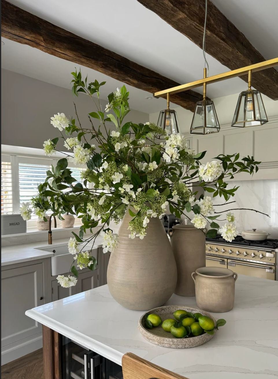
Decorate with Plants & Flowers
Decorate with plants and flowers, utilizing their natural differences in texture to enrich the room's design.While you can physically touch plants, they primarily contribute a visual texture.
The variation in form, petal and leaf shapes, height, color, and container all contribute to a room's textural decor.
Aim to select plants and flowers that complement other textures in the space, like the shiny green leaves of a large palm coordinating with sleek, lacquered furniture.
Likewise, choose vases that echo existing textures in the room, whether in ornaments or lamp bases.

The Power Of Lighting
Don’t underestimate the power of lighting; it can transform the textural feel of the space through both the fixture’s materiality and the quality of light emitted. Lighting in a room offers a dual aspect of texture. The design and material of the lamp itself contribute to the room's texture.
For instance, a high-shine chrome floor lamp provides a distinct texture compared to a hammered bronze wall sconce.
However, the texture becomes more visually apparent through the light rays themselves. Warm white light (about 300 kelvins) casts a softer, more ambient glow, while cool white light (around 500 kelvins) emits a brighter, more contemporary beam that can make the atmosphere feel more stark.
The placement of these light sources also affects texture— an unlit corner can transform into an inviting reading nook with strategic lighting. Lighting is arguably the most complex element when it comes to texture, involving a mix of different source styles, selecting the appropriate bulb temperature, and arranging light sources at various levels to create layers of illuminated texture throughout the room.

The Psychology of Colour
Colour is more than just for visual pleasure; it is a powerful tool that influences mood, and psychological responses. In interiors, it needs to be given careful consideration, as the overall objective of interior design should be to create a beautiful environment which enhances the wellbeing of the space's occupants.
Colour is more than just for visual pleasure; it is a powerful tool that influences mood, and psychological responses. In interiors, it needs to be given careful consideration, as the overall objective of interior design should be to create a beautiful environment which enhances the wellbeing of the space's occupants.
COLOUR IS MORE THAN JUST FOR VISUAL PLEASURE…
Colour psychology studies show how hues can dictate our feelings, emotions and overall mood. Take the example of my friend, who insisted on painting her walls in her living room bright orange, much to her husband's dismay. Their constant quarreling is testament to the power that colour has over our emotional responses and how it can impact our mood. Orange is a colour which evokes a feeling of vibrancy and energy, a good colour for exercise rooms or any space where you need a burst of enthusiasm. Certainly not the colour for a relaxing open plan living room kitchen, the central hub of the house.
Googles Exhibition at the Salon De Mobilier in Italy this year, demonstrated to visitors just this. The Google exhibition showcased the company's innovative approach to design, with a strong focus on color psychology. The exhibition featured interactive installations that explored the impact of colour on mood, emotions, and behaviour.
Google’s displays demonstrated how different hues could influence a person's sense of well-being and productivity. They also illustrated how color choices could shape the atmosphere of living and working spaces, highlighting Google's emphasis on user-centric design principles that take into account the psychological effects of color.
The exhibition seamlessly integrated technology and design, emphasizing the role of color in creating functional and aesthetically pleasing environments. The power of colour to affect both our biology and psychology and how powerful it is in evoking emotions
COLOURS ARE CHOSEN TO INVOKE A REACTION AND CREATE A MOOD…
In 1810 Johan Wolfgang von Goethe made a significant contribution to our understanding of colour through his work “theory of Colour”. His work reminds us that our experience of the world is not shaped by physical phenomena alone but by our sensory and emotional responses to those phenomena.
In interior design colours are chosen to invoke a particular reaction within people and to create a mood. When making choices in your own home, be sure to make them when you are in a positive headspace. Be careful that the colour you are attracted to at the time, may reinforce how you feel at that particular moment. Something along the lines of don’t go grocery shopping when you are hungry.
COLOURS & THEIR PSYCHOLOGICAL EFFECT

Blue: known for its calming and serene effects.
Ideal for bedrooms and bathrooms where relaxation is paramount
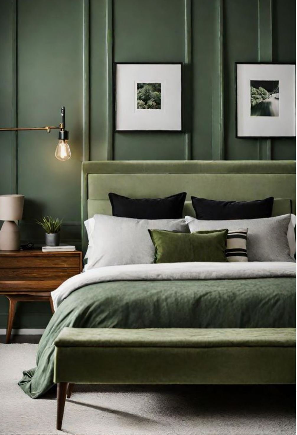
Green: The colour we associate with nature, promotes tranquility and health.
Perfect colour for spaces you want to foster rejuvenation like a reading room or a home office
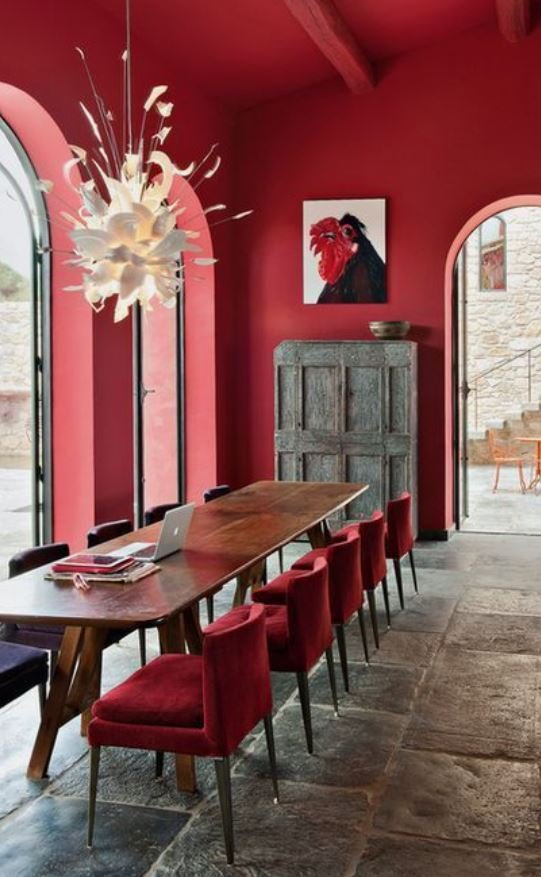
Red: Often linked to excitement and passion.
Red works well in areas which need a high energy level

Purple: Dark purple can evoke a feeling of luxury while lighter shades like lavender can instil a soothing calming feeling.
Good for use in Spas and wellness areas
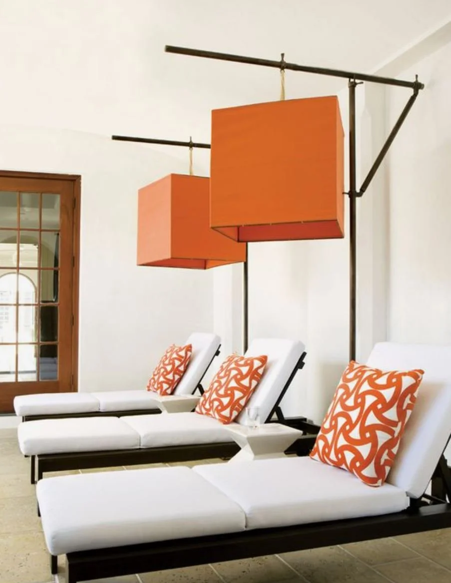
Orange: Vibrant and energetic, great for spaces that need energy like exercise rooms

Neutrals: These colours offer a background, like an artists canvas you can keep the palette neutral all the way through.
Add the true for interest or you can add pops of colour through soft furnishings
HOW TO EFFECTIVELY USE COLOUR PSYCHOLOGY IN YOUR HOME
To effectively use colour psychology in your home, it's important to identify what the function will be of each space or room, and the atmosphere you wish to create.
Consider these key elements before finalising your colour palette :
● Purpose of the space - identify what activities will take place in this space or room. For example a bedroom should promote relaxation and sleep and a study should facilitate focus and creativity
● Lighting - Natural lighting and artificial light will significantly impact how colours look in the same space. Lighter colours can make a room seem larger and brighter in low-light conditions. Dark colours tend to create a more intimate and grounded atmosphere.
● Colour combinations - combining colours can either neutralise or enhance their psychological effects. For example, pairing a vibrant orange with a calming blue can can balance our the energy levels in a room, suitable for a lively but balanced living room
● Personal Preferences - these should always be considered but align them with how the space will be used. Tones can be adapted to help this
● Texture and Materials - Texture should always enhance and complement the colour palette. For instance a soft plush velvet in a calming blue can enhance its soothing effects while a shiny red surface can intensify its energy levels.
The strategic use of colour in interior design can dramatically influence how you experience your home. Understanding the basis of colour psychology can help you make informed decisions which will transform your home into a sanctuary, that reflects your unique lifestyle and enhances your well-being.

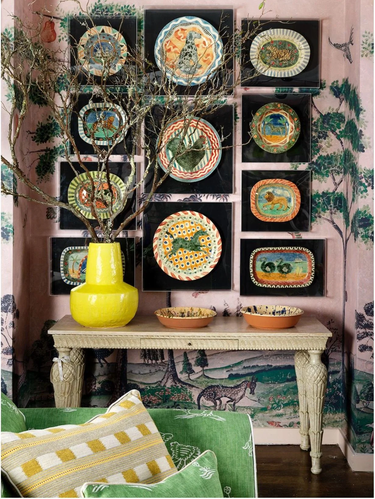
How To Display Art In Your Home
Art has the ability to transform your home and help create interiors which have more of an impact.A room design can start with one piece of artwork. It can act as the focal point anchoring the space and guide the palette for the entire scheme. Place your art where you will see it. Place works in the rooms you spend the most time with family, where they will be seen and enjoyed on a daily basis
Art has the ability to transform your home and help create interiors which have more of an impact.A room design can start with one piece of artwork. It can act as the focal point anchoring the space and guide the palette for the entire scheme. Place your art where you will see it. Place works in the rooms you spend the most time with family, where they will be seen and enjoyed on a daily basis

I recommend hanging pieces in the kitchen, living room and any spaces in your home where you spend a lot of time. For gallery walls,try to create loose cohesion by restricting your frames to one or two colours and similar styles. Approach the placement of artwork strategically. Use scale and proportion to help you judge this. Large pieces benefit from space around them and distance for viewing. Smaller pieces are good for close up viewing, and when grouped can make a wonderful focal point.
SO HOW DO YOU DISPLAY ART WELL?

High Ceilings
If the room has very high ceilings, or you’re hanging over furniture, go with what feels looks proportional in the space. Start with a 160cm eye line and start from there.Make sure the wire behind the painting is taut. If you have an exceptionally heavy artwork, it may be worth investing in a french cleat system. This will balance the weight.

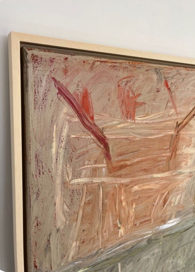
Framing Artwork
Framing artwork is key and I like to keep it simple but beautiful. Frames are an investment, but when done well they really make a difference to how the piece looks once it’s hung.
High Float Mounting is a wonderful sculptural technique in a box frame. The artwork is floated above the mounted board on another board and then placed in a box frame.
There is the more traditional window mount technique which can be used for photographs. Be generous with the mounting around the art and give an additional cm at the bottom. A great way to create colour is to pick out a colour from the artwork and match the moulding.
For canvas artworks, I like to use tray frames in various colours.

Glass
I tend to use non reflective glass, especially in a room which has a lot of light. I use museum glass or TRU Vue 92. If the work is large, use Perspex or acrylic to keep the overall weight down.
HOW TO FIX YOUR ART TO THE WALL?

Make it stand out
“The EXHIBIT” MULTI HANGING PHOTO FRAME BY UMBRA - Is an easy way to create an eye catching salon style wall (Johnlewis.com)
Watercolours
Watercolours on the other hand require far less lighting. The style of your home will influence how you light your paintings. In more traditional homes a picture light would seem acceptable, but the best option for me is to have recessed downlights. Lighting artwork in relation to the rest of the room can create a great sense of drama. Layers of lighting are key. For instance you could have only the LED spots illuminated in the room on the artwork, and soft lighting elsewhere in the space.

Ledge Display
For a picture ledge display - The Mosslanda picture ledge by IKEA come sin minimalist black or white. Colour coordinate the colour of the ledge with your picture frames.(IKEA.COM)

The Right Rails
Picture rails - cast from solid brass, (willow and stone.co.uk)
Placing On The Wall
For a no drill alternative: Especially if you are in a rental property. Try 3M’s “command” plastic adhesive strips from B&Q. (DIY.com)

Traditional Hanging
Used in conjunction with D rings and picture wire is one of the simplest ways to hang an artwork. Measure the wire so it’s double the width of the frame, and pull through the rings so it sits about 2inchs from the top of the pictureframe. (Ironmongerydirect.co.uk)